Financial market participants take the National Bureau of Economic Research (NBER) as the definitive source of a recession. NBER’s business cycle dating committee identifies business cycle peaks and troughs to describe recessions and expansions. They define a recession in the following way:
A recession is a significant decline in economic activity spread across the economy, lasting more than a few months, normally visible in real GDP, real income, employment, industrial production, and wholesale-retail sales.
Such a definition is sensible. Coincident declines in these indicators often characterize periods of poor performance for risky assets. However, there are other ways to think about recessions. We might start from important financial variables.
This study will begin by evaluating the following two indicators and a logistic regression estimation to characterize recession periods:
- investment grade corporate credit spreads
- trade-weighted U.S. dollar
We will fit models to the NBER recession dates. The goal is to find a model which both fits the NBER recession data well, but provides additional information about other periods where we might worry about broad economic performance.
The analysis proceeds in 7 steps:
- Retrieve economic data
- Clean data
- Prepare data for modeling
- Model 1
- Model 2
- Model 3
- Model evaluation
- Conclusion
Step 1: Retrieve data
The data we need is for both of our desired series, as well as the NBER recession dates.
# load libraries

library(tidyquant)
library(broom)
library(modelr)
library(pscl)

# define desired series

series <- data_frame(series = c("baa_corporate_bond_spread", "tw_usd", "recession"),
                     symbol = c("BAA10YM", "TWEXBMTH", "USREC"))

# import data from FRED

import.data <- tq_get(series$symbol,
                      get = "economic.data",
                      from = as.Date("1973-01-01"))
Step 2: Clean data
# check to make sure each data series has the same number of observations
# remove the one row with the maximum date

if (max(import.data %>%
         filter(symbol == series$symbol[1]) %>%
         pull(date)) !=
    max(import.data %>%
         filter(symbol == series$symbol[2]) %>%
         pull(date))) {

  import.data <- import.data %>% filter(!date == max(date))

} else if(max(import.data %>%
         filter(symbol == series$symbol[1]) %>%
         pull(date)) !=
    max(import.data %>%
         filter(symbol == series$symbol[3]) %>%
         pull(date))) {

  import.data <- import.data %>% filter(!date == max(date))

}

# final check to make sure each series has the same number of observations

import.data %>% group_by(symbol) %>% summarize(n = n())
## # A tibble: 3 x 2
## symbol n
## <chr> <int>
## 1 BAA10YM 546
## 2 TWEXBMTH 546
## 3 USREC 546Step 3: Prepare data for modeling
First, we will look at a plot of the two series.
ggplot(import.data %>% filter(symbol != "USREC"),
       aes(date, price)) +
  geom_line(size  = 1,
            color = rgb(12, 81, 132, maxColorValue = 255)) +
  facet_wrap(~ symbol, scales = "free_y") +
  theme_bw(base_size = 11) +
  theme(axis.text = element_text(color = "black"))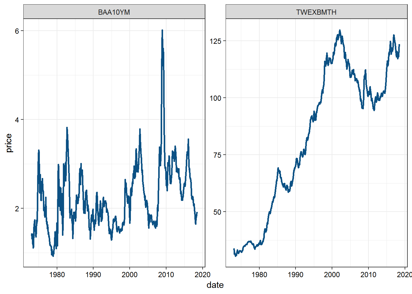
Next we check correlation.
cor(import.data[which(import.data$symbol == "BAA10YM"), "price"],
    import.data[which(import.data$symbol == "TWEXBMTH"), "price"])
## price
## price 0.3266942There is some correlation between the two variables. One way to try to reduce the impact of this correlation is to take the first principal component of these two series and use that as our independent variable in the logistic regression.
Step 4: Fit Model 1 | PCA
# transform data into matrix for pca

pca <- import.data %>%
  filter(symbol != "USREC") %>%
  spread(symbol, price, drop = TRUE) %>%
  select(-date) %>%
  princomp(., cor = TRUE)

# extract scores for first principal component

pc1 <- pca$scores[ ,1]

# now we can create a dataframe with the independent variable as the pc1

pc.test <- data_frame(usrec = import.data %>% filter(symbol == "USREC") %>% pull(price),
                      pc1 = pc1)

# implement the binomial model

model.pca <- glm(usrec ~ pc1, data = pc.test, family = binomial("logit"))

# create plot data

plot.model.pca <- data_frame(date = 1:nrow(pc.test),
                         actual = pc.test$usrec,
                         pred   = model.pca$fitted.values)

# plot

ggplot() +
  geom_line(data = plot.model.pca, aes(date, actual), color = "black") +
  geom_line(data = plot.model.pca, aes(date, pred), color = "blue") +
  labs(x = "",
       y = "Probability of Recession",
       title = "Recession Probability | PCA BAA Corp Spread + Trade Wtd U.S. Dollar") +
  theme_bw(base_size = 11) +
  theme(axis.text = element_text(color = "black"))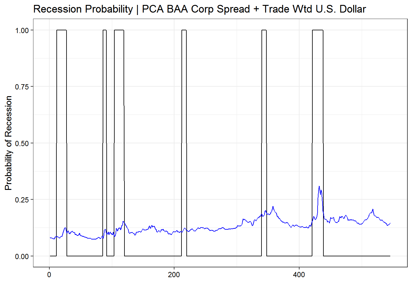
Step 5: Fit Model 2 | Percent change
That didn’t work very well. The next thing to try is to transform the data into annual percent change. Perhaps that is more predictive.
data.diff <- import.data %>%
  group_by(symbol) %>%
  mutate(yr.diff = case_when(
           symbol == "BAA10YM" ~ (price - lag(price, 12)),
           symbol == "TWEXBMTH" ~ (price / lag(price, 12) - 1),
           TRUE ~ price)) %>%
  filter(date >= min(date) + years(1)) # remove rows w/ NA observations for all symbols
With the data prepared, we can now estimate a new regression.
model.diff.data <- data.diff %>%
  select(date, symbol, yr.diff) %>%
  spread(symbol, yr.diff)

model.diff <- glm(USREC ~ BAA10YM + TWEXBMTH, data = model.diff.data, family = "binomial")

plot.model.diff <- data_frame(date = model.diff.data$date,
                         actual = model.diff.data$USREC,
                         pred   = model.diff$fitted.values)

# plot

ggplot() +
  geom_line(data = plot.model.diff, aes(date, actual), color = "black") +
  geom_line(data = plot.model.diff, aes(date, pred), color = "blue") +
  labs(x = "",
       y = "Probability of Recession",
       title = "Recession Probability | BAA10YM Corp Spread + Trade Wtd U.S. Dollar",
       subtitle = "Annual Change in Spread and % Change in U.S. Dollar") +
  theme_bw(base_size = 11) +
theme(axis.text = element_text(color = "black")) 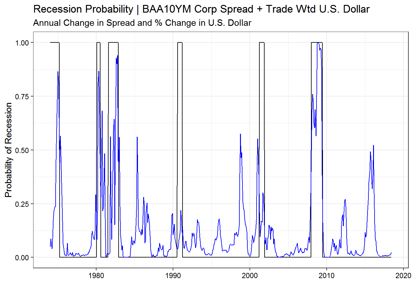
Now we are getting somewhere. Let us evaluate this model to think about how we might improve it. First let us look at the variable significance and importance.
broom::tidy(model.diff)## term estimate std.error statistic p.value
## 1 (Intercept) -3.035756 0.2602218 -11.666032 1.900850e-31
## 2 BAA10YM 2.733231 0.3121244 8.756866 2.007545e-18
## 3 TWEXBMTH 3.675707 2.2471265 1.635736 1.018948e-01Here we see that the corporate bond spreads drive the result. Not only is the t-statistic (as a proxy for variable importance) for corporate bond spreads ~5x as large as for the USD, the USD coefficient is not statistically different from 0.
Step 6: Fit Model 3 | Percent change corporate bond spreads only
Let us re-estimate the model using only the annual change in corporate spreads. We can then compare that model to the model which contains both spreads and the USD.
model.diff.data.corp <- data.diff %>%
  filter(symbol != "TWEXBMTH") %>%
  select(date, symbol, yr.diff) %>%
  spread(symbol, yr.diff)

model.diff.corp <- glm(USREC ~ BAA10YM, data = model.diff.data.corp, family = "binomial")

plot.model.diff.corp <- data_frame(date = model.diff.data$date,
                         actual = model.diff.data.corp$USREC,
                         pred   = model.diff.corp$fitted.values)

# plot

ggplot() +
  geom_line(data = plot.model.diff.corp, aes(date, actual), color = "black") +
  geom_line(data = plot.model.diff.corp, aes(date, pred), color = "blue") +
  labs(x = "",
       y = "Probability of Recession",
       title = "Recession Probability | BAA10YM Corp Spread",
       subtitle = "Annual Change in Spread") +
  theme_bw(base_size = 11) +
theme(axis.text = element_text(color = "black")) 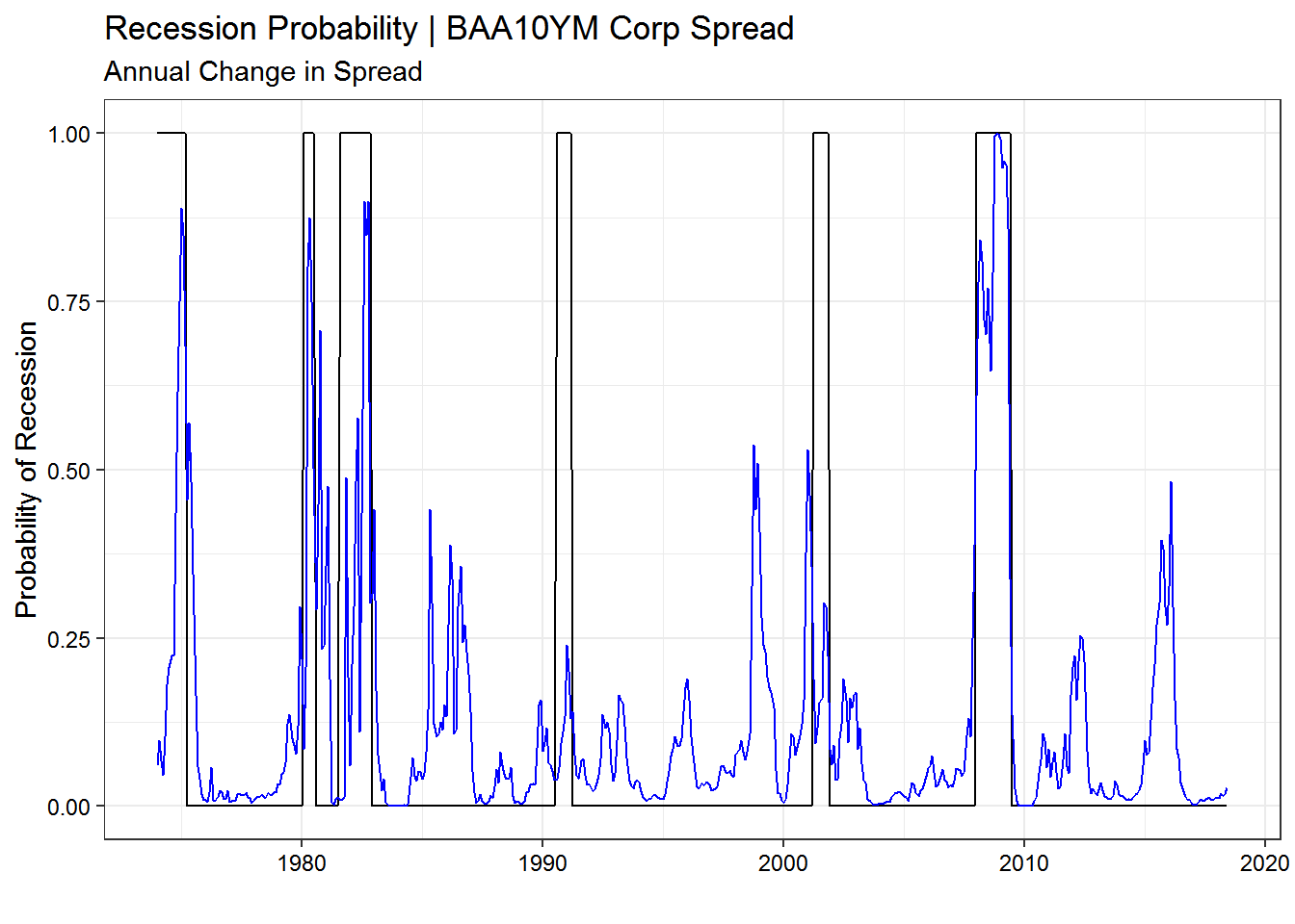
Step 7: Comparing models and concluding
From the plot alone, it is difficult to tell if the more parsimonious model performs better. To assess the goodness of fit, we can use McFadden’s \(R^{2}\). Unlike linear regression, we do not expect McFadden’s \(R^{2}\) to approach 1 for a strong fit. Any \(R^{2}\) approaching 0.5 demonstrates a strong fit.
# compare two model fits with McFadden's R^2

list(model.diff = pscl::pR2(model.diff)["McFadden"],
     model.diff.corp = pscl::pR2(model.diff.corp)["McFadden"])
## $model.diff
## McFadden
## 0.3593089
##
## $model.diff.corp
## McFadden
## 0.3529084The McFadden \(R^{2}\) does not provide any conclusive evidence for which model is better, but it does show that both models do a decent job fitting NBER recessions.
Another method to compare the models is to evaluate which model has more outlier residuals. If one model has significantly fewer say, 2.5 standard deviation residuals, it will likely perform better out of sample.
residual.data.model.diff <- augment(model.diff) %>%
  mutate(index = 1:n()) %>%
  mutate(model = "model.diff")

residual.data.model.diff.corp <- augment(model.diff.corp) %>%
  mutate(index = 1:n()) %>%
  mutate(model = "model.diff.corp")

# combine two dataframes for plotting

residual.data.combined <- bind_rows(residual.data.model.diff,
                                    residual.data.model.diff.corp) %>%
  mutate(USREC = as.factor(USREC)) # for plotting

# plot

ggplot(residual.data.combined, aes(index, .std.resid, color = USREC)) +
  geom_point(alpha = 0.5) +
  geom_ref_line(h = 2.5) +
  geom_ref_line(h = 0, size = 1, colour = "black") +
  facet_wrap(~ model, scales = "free_y") +
  scale_color_manual(values = c(rgb(12, 81, 132, maxColorValue = 255),
                     rgb(119, 148, 60, maxColorValue = 255))) +
  guides(color = FALSE) +
  theme_bw(base_size = 11) +
  theme(axis.text = element_text(color = "black"))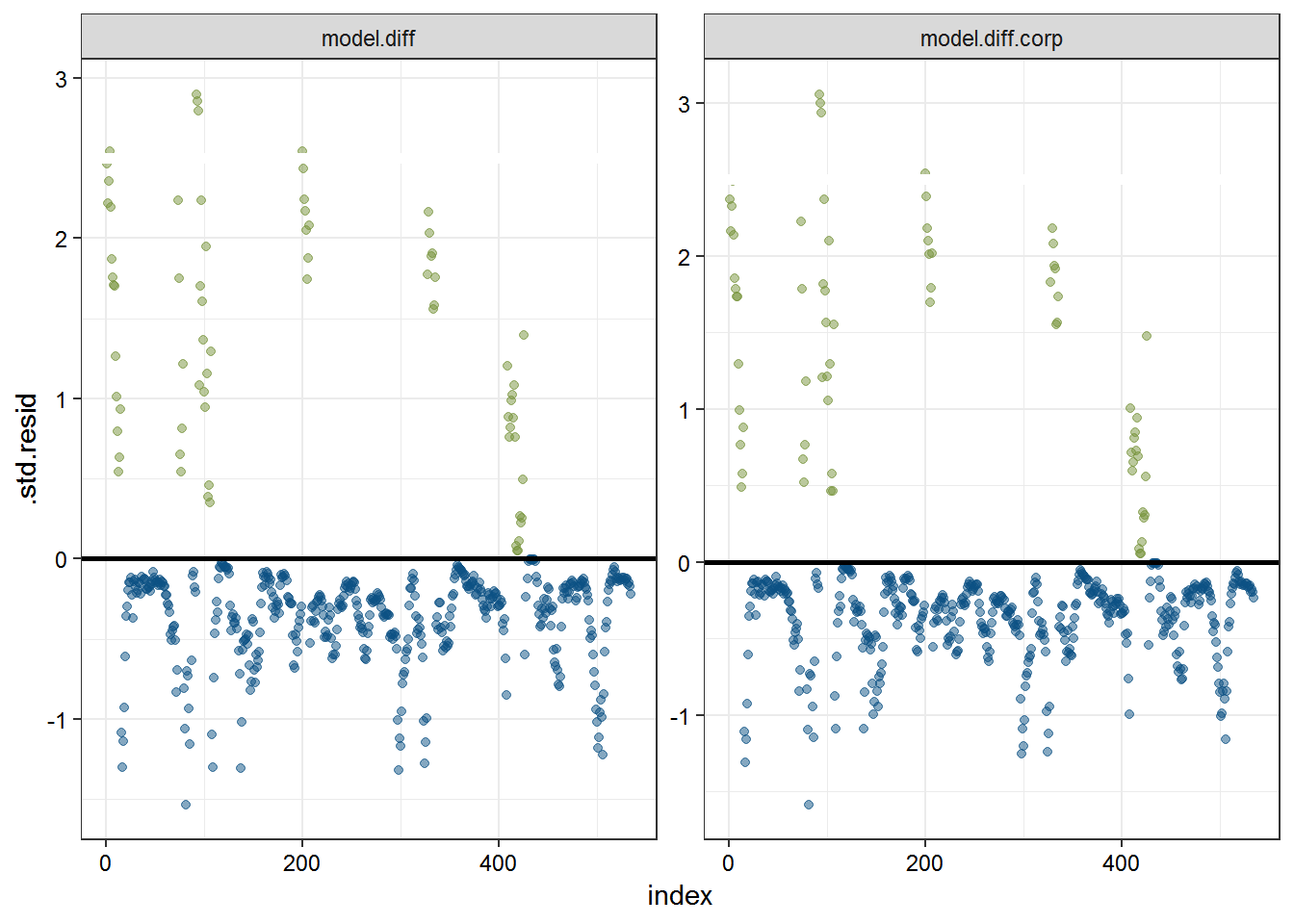
Again, a look at the major residual outliers across the two models reveals little new information. As a final pass, we might simply compare the sum of the standard residuals to see if there is any significant difference.
residual.data.combined %>%
  group_by(model) %>%
  summarize(sum.std.resid = sum(.std.resid))
## # A tibble: 2 x 2
## model sum.std.resid
## <chr> <dbl>
## 1 model.diff -66.9
## 2 model.diff.corp -67.8Little in the way of signal about model is better. Either works, but because of the marginally higher McFadden \(R^{2}\) and the marginally lower sum of standard residuals, we can feel decently comfortable using the first model (with both corporate bond spreads and the trade weighted USD) to keep our eye on dangerous periods for the U.S. economy.
Step 8: Conclusion
In this post we attempted to fit a model to analyze recession periods in the U.S. The method we used was logistic regression. We took two important financial variables–BAA corporate bond spreads over the 10-year Treasury and the broad trade weighted U.S. dollar index–and regressed those against NBER defined recession periods.
The first model used the first principal component of the undifferenced independent variables to estimate recession probability. This was a bad model because of the correlation between the two variables, and PCA didn’t ameliorate the problem.
The second model (and the one we will consult in the future) used the annual difference of the BAA corporate bond spread and the annual % difference in the trade weighted broad USD to estimate recession probability. This model was a major improvement over the first and provides useful information about economic stress, both in relation to NBER defined recession periods and more generally. This model highlights 1994, 1998, 2010, and 2016 as rough periods. For financial market participants, this makes sense.
The final model was a more parsimonious version of the second model and used only BAA corporate bond spreads. It is nearly as good as the second model and would also be useful for evaluation in the future.
Resources:
https://stats.stackexchange.com/questions/4831/regression-transforming-variables/4833#4833 https://onlinecourses.science.psu.edu/stat857/node/130/ https://www.researchgate.net/post/Can_we_do_PCA_before_logistic_regression http://uc-r.github.io/logistic_regression