In today’s episode of R versus the world, we put our valiant verbiage up against the messy, nasty hobbitses Census Bureau new home sales data.
This short adventure features the potency of pdftools and purr. The motivation? The cloud of economic bear-ism has lately landed on new home sales. The reason for the weather change was an unexpectedly large drop in new home sales, to the tune of -5.3% in June (and that was off a May number which was revised lower). Should we don our ursine fur and make for hibernation?
No.
Besides the steady, year-over-year up trend, worrying now seems premature. Most important, the margin of error on the latest reading is ±17.1%! We are not the only sanguine penguins. Argument from authority would have us bring the peerless Bill McBride, John Burns, and Len Kiefer to the courthouse.
Has the Housing Market Peaked? (Part 2) https://t.co/I3RTDUpVRE
— Bill McBride (@calculatedrisk) July 24, 2018
Just went thru all our data by MSA on a cross country flight. Risks are high but I agree with Bill.
— John Burns (@johnburnsjbrec) July 24, 2018
Monthly estimates uncertain and even the year-to-date (sum through June) total
— 📈 Len Kiefer 📊 (@lenkiefer) July 26, 2018
table 1 (pdf) https://t.co/IDHMLCkY0D pic.twitter.com/EGdjh07zaF
It seems like those who want to find disaster do so too with too much facility in this month’s new home sales number. Rest easy, dear readers, Verbum Data will keep our eyes on the monitor for this data series as we wind towards Q4.
A bit of Rstory Home Sales Style
But we wanted to know more about these historical margin of error estimates. Unfortunately, the Census Bureau doesn’t offer database access to their real-time monthly estimates of margin of error.
The magic of R will allow us to access these historical estimates. PLEASE KEEP IN MIND, these estimates are only good in the month they are printed. The primary reason is that the data gets revised after the fact.
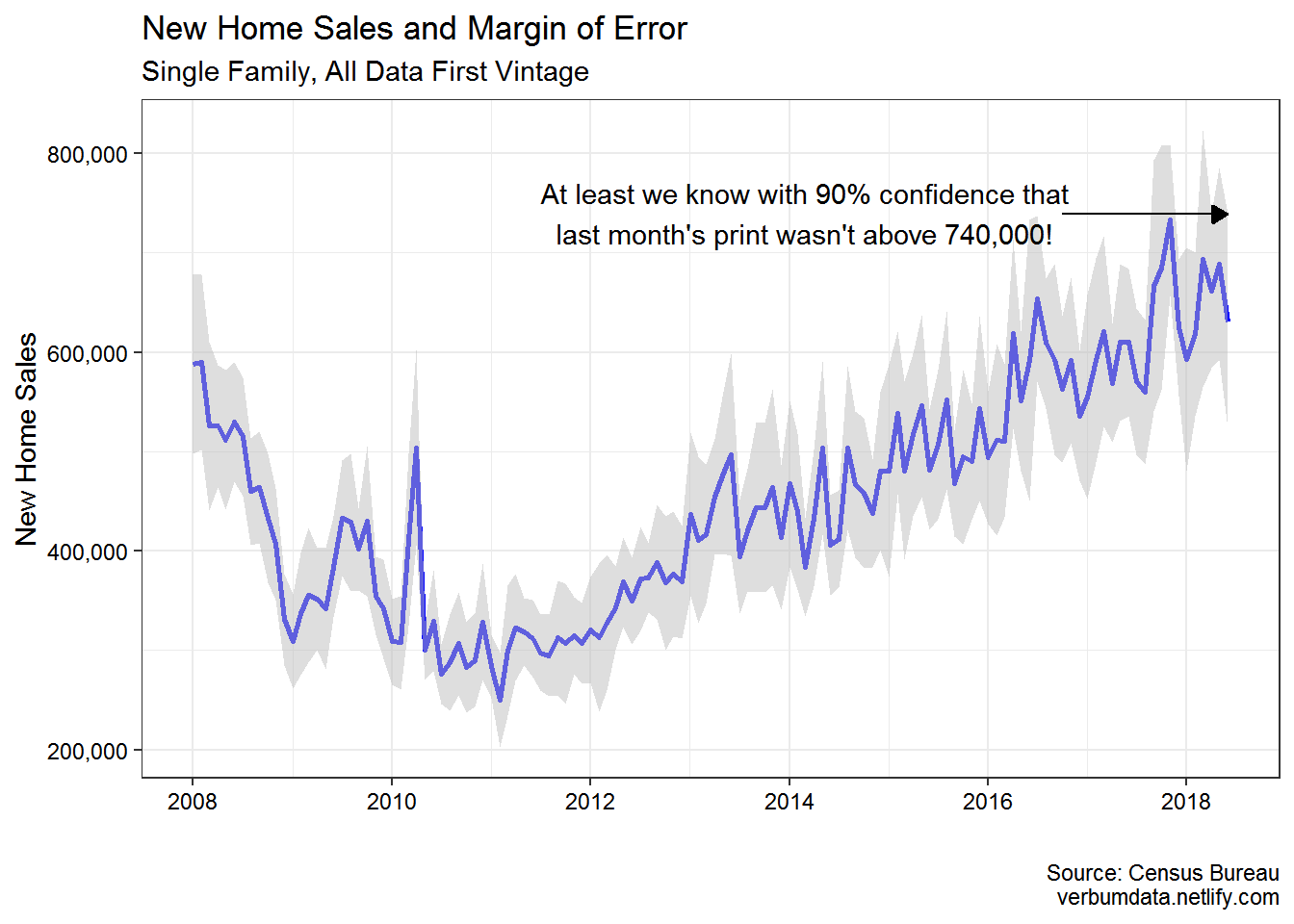
What, then Verbum Data is the point of the exercise? Well, we like to live in the moment, even when we think historically. The volatility in the plot below shows why too much fretting over one month’s print may not be good for your health.
# load up libraries

library(tidyverse)
library(pdftools)
Our first task is to create the links we will scrape. With that done, we can purrr::map like the Rtographers we are to pull in the data we desire
links <- paste0(rep("https://www.census.gov/construction/nrs/pdf/newressales_", 126),
                str_sub(as.character(seq(as.Date("2008-01-01"), Sys.Date(), by = "month")), 1, 4),
                str_sub(as.character(seq(as.Date("2008-01-01"), Sys.Date(), by = "month")), 6, 7)
                , ".pdf") %>%
  sort() %>%
  head(., -1)

# pull in the data

census_import <- map(links, ~ pdftools::pdf_text(.x) %>% .[1])
That done, we will now extract the real-time (historical) Census estimates for the seasonally adjusted annual rate (SAAR) of new home sales.
saar <- map_dbl(census_import, ~ as.numeric(gsub(",", "", str_extract(.x, "(?<= seasonally adjusted annual rate of )[0-9|,]*"))))

moe <- map(census_import, ~ str_extract_all(.x, "(?<=±)[[:digit:]]+\\.*[[:digit:]]*"))

census_data <- data_frame(date = as.Date(NA), value = rep(NA, length(links)), moe = rep(NA_real_, length(links)))

# fill 'er up

for(i in seq_along(moe)) {
  census_data$date[i] <- seq(as.Date("2008-01-01"), Sys.Date(), by = "month")[i]
  census_data$value[i] <- saar[i]
  census_data$moe[i] <- as.numeric(moe[[i]][[1]][1])
}

# add in margin of error estimate

census_data <- census_data %>%
  mutate(upper_bound = value * (1 + (moe / 100)),
         lower_bound = value * (1 - (moe / 100)))
Data pulled, it is off to plotting. As a reminder, this plot is meant to show the variability of the FIRST read of each new home sales estimate along with its attendant margin of error estimate. The results are shocking…sort of.
ggplot() +
  geom_line(data = census_data,
            aes(date, value),
            color = "blue",
            size = 1) +
  geom_ribbon(data = census_data,
              aes(date, ymin = lower_bound, ymax = upper_bound),
              alpha = 0.5,
              fill = "grey") +
  geom_segment(data = census_data,
               aes(x = as.Date("2016-10-01"), xend = as.Date("2018-06-01"),
                   y = 739000, yend = filter(census_data, date == as.Date("2018-06-01")) %>%
                     pull(upper_bound)),
               color = "black",
               arrow = arrow(type = "closed", length = unit(0.25, "cm"))) +
  annotate("text", x = as.Date("2014-03-01"), y = 740000, label = "At least we know with 90% confidence that\nlast month's print wasn't above 740,000!") +
  scale_y_continuous(labels = scales::comma) +
  theme_bw(base_size = 11) +
  labs(x = "",
       y = "New Home Sales",
       title = "New Home Sales and Margin of Error",
       subtitle = "Single Family, All Data First Vintage",
       caption = "Source: Census Bureau\nverbumdata.netlify.com") +
  theme(axis.text = element_text(color = "black"))
For now, that is all, ladies and gentlemen. We hope this post demonstrated to you the incredible efficacy of R and the incredible danger of reading too much into any one month’s worth of economic data.