For those uninterested in the R code, please skip through it.
Much has been made in the past few months of the slowdown in the U.S. housing market. Yours truly flippantly reported on one of the first large negative new home sales prints earlier this year.
The esteemed single-family commentariat quoted in the earlier article were also less than concerned with June 2018’s initially reported -5.3% drop in new home sales. Revised data now show the June drop in new homes sales at -6.2%. And June was not an outlier. Six of the ten months in 2018 registered monthly sales declines.
It remains true that more new homes were sold year-to-date in 2018 than were sold from January to October in 2017 (6.2 million versus 6.0 million). Despite this 2.7% annual increase, we want to investigate a major suspect in the slowdown: affordability.
Len Kiefer has documented the jump in mortgage rates in 2018. Here is his cool visualization of 30-year mortgage rates in recent years.
But are higher mortgage rates driving the slowdown in housing activity? We run a few preliminary analyses to test the theory.
Outline:
- Mortgage rates in 2018
- Home sales activity by state
- Pulling in data for regression
- Is housing affordability pulling down sales?
- Evaluating the regression
- Tuning the regression
- Conclusion
Mortgage rates in 2018
There is little doubt that mortgage rates are up in 2018. The median 30-year conventional fixed mortgage rate in 2018 is the highest median reading since 2010. A few starting plots set the rate scene.
# load libraries

library(MASS)
library(sfsmisc)
library(tidyquant)
library(tidycensus)
library(scales)
library(rvest)
library(patchwork)
library(zoo)
library(stringi)
library(broom)


# get mortgage rate data and plot

mtg.rate <- tq_get("MORTGAGE30US",
                 get = "economic.data",
                 from = "2000-01-01")

mtg.rate %>%
  filter(date > "2010-01-01") %>%
  ggplot(aes(date, price)) +
  geom_line(color = "dodgerblue4", size = 1) +
  labs(x = "",
       y = "% 30-year Mortgage Rate",
       title = "30-year mortgage rates are up in 2018",
       subtitle = "Weekly average 30-year fixed rate mortgage",
       caption = "Source: Freddie Mac PMMS") +
  scale_x_date(date_breaks = "2 years",
               limits = c(ymd("2010-01-01"), ymd("2018-12-08")),
               date_labels = "%Y",
               expand = c(0, 0, 0, 0)) +
  scale_y_continuous(labels = function(x) paste0(x, "%"),
                     limits = c(3, 5.25),
                     expand = c(0, 0)) + # make use of the handy patchwork '+'

  ggplot(mtg.rate %>%
           filter(date > "2010-01-01") %>%
           group_by(year(date)) %>%
           summarize(med = median(price)), aes(`year(date)`, med)) +
  geom_bar(stat = "identity", fill = "dodgerblue4") +
  labs(x = "",
       y = "",
       subtitle = "Median weekly 30-year fixed mortgage rate by year") +
  scale_x_continuous(breaks = seq(2010, 2018, by = 2),
                     labels = seq(2010, 2018, by = 2)) +
  scale_y_continuous(labels = function(x) paste0(x, "%"),
                     limits = c(3, 5.25),
                     oob = rescale_none,
                     expand = c(0, 0))
## Warning: Removed 9 rows containing missing values (geom_path).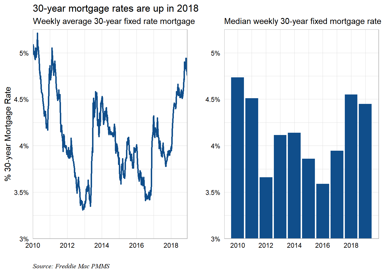
Rates are up. As a quirky side note, we highlight to readers that the 30-year mortgage rate is up 0.80% since the start of the year. Meanwhile, the 10-year treasury is only 0.43% higher on the year. We know average FICO scores are still quite high. Thus the spread widening in 30-yr mortgage rates reflects other capital market dynamics (lower Fed MBS reinvestment, higher comparably rated corporate credit spreads, etc.).
A closer look at home sales activity in 2018
This question deserves empirical rigor to be answered definitively. We don’t think the following analysis meets that standard. It will provide hints and suggestions, though.
If higher rates have stunted housing activity by raising monthly mortgage costs, we would expect housing activity to have slowed less in more affordable markets. We will assume that credit underwriting standards have not changed significantly over the course of the year. We will attempt to control for state-level differences in credit scores.
The first step is to pull home sales activity from Zillow.
# read in from zillow

sales.import <- read_csv("http://files.zillowstatic.com/research/public/State/Sale_Counts_Seas_Adj_State.csv")

# tidy the data

sales.data <- sales.import %>%
  select(-RegionID) %>%
  gather(date, sales_sa, 3:ncol(.)) %>%
  mutate(sales_sa = log(sales_sa)) %>% # log to clean up distribution
  rename(state = RegionName, size_rank = SizeRank) %>%
  mutate(date = ymd(paste0(date, "-01"))) %>%
  group_by(state) %>%
  arrange(date) %>%
  mutate(sales_3mma = rollmean(sales_sa, 3, na.pad = TRUE, align = "right")) %>%
  filter(!is.na(sales_3mma)) %>%
  filter(date == max(date) | date == "2017-12-01") %>%
  mutate(date = case_when(
    date == "2017-12-01" ~ "start",
    TRUE ~ "end")) %>%
  select(-sales_sa) %>%
  spread(date, sales_3mma) %>%
  mutate(sales_chg_log = end - start) %>%
  select(state, sales_chg_log)
Let’s take a quick look at the dynamics in home sales activity by state. The slowdown has been significant at the national level so understanding which states are driving the move will be interesting. Zillow includes all home sales in their figure. I’ve used the seasonally adjusted version. Notes on the home sales count methodology can be found here
sales.data %>%
  mutate(pct_chg = exp(sales_chg_log) - 1) %>%
  ggplot(aes(fct_reorder(state, pct_chg * -1), pct_chg)) +
  geom_col(fill = "dodgerblue4") +
  coord_flip() +
  labs(x = "",
       y = "% Change in Home Sales YTD 2018",
       title = "Home sales west of the Mississippi have slowed in 2018",
       subtitle = "% Change in home sales YTD in 2018*",
       caption = "verbumdata.netlify.com\n*Calculated as the % difference between the 3 month moving average of Zillow's monthly\nreported seasonally adjusted home sales in Dec 2017 and the latest value\nSource: Zillow") +
  scale_y_continuous(labels = percent)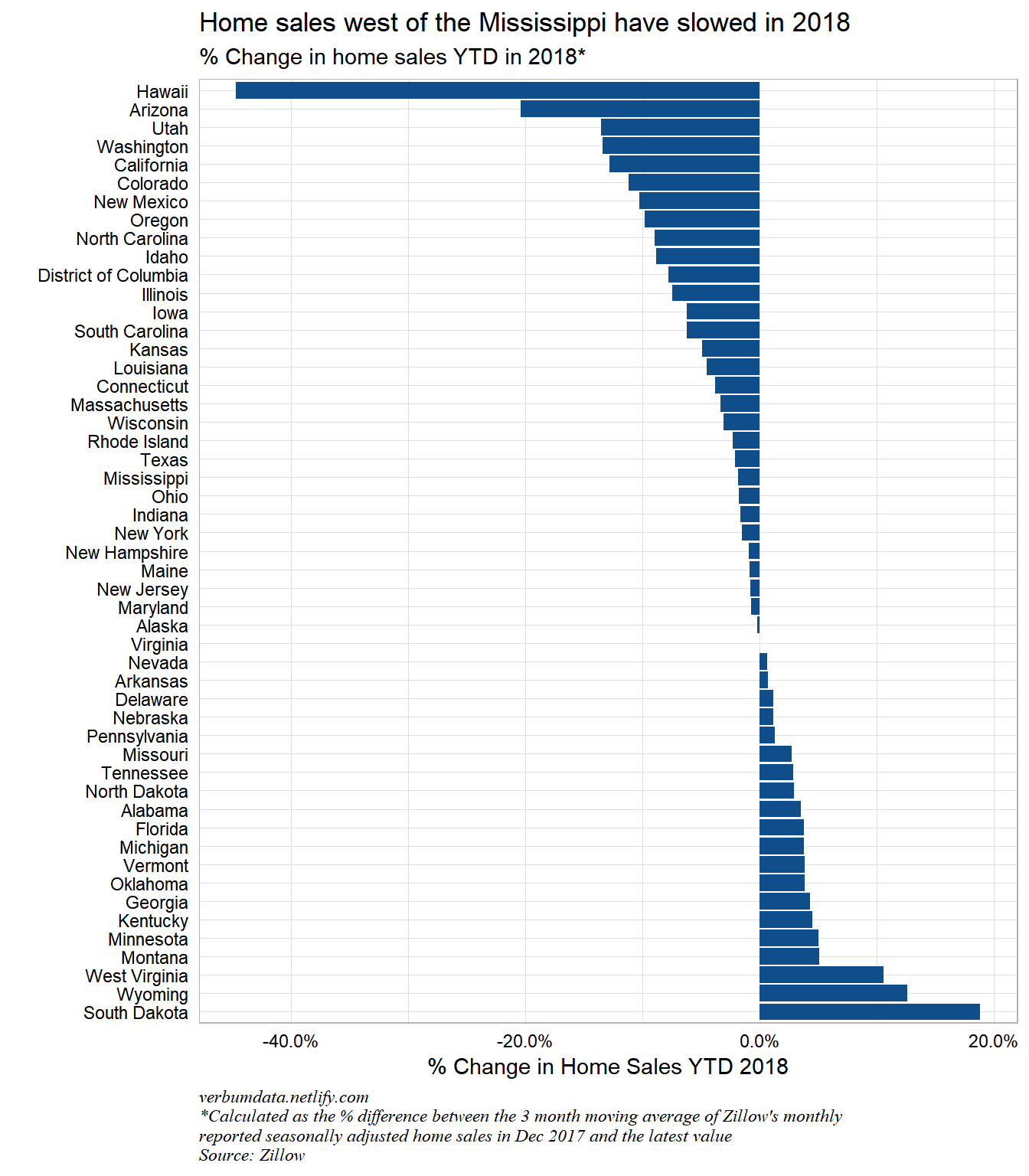
Pulling home price to income ratios and other independent variables
We’ve pulled the sales data at the state level. While the state level data won’t provide us with a large sample, I preferred to avoid MSA data because the sales reporting and sample size issues would dominate.
Unfortunately, Zillow does not make state level price to income ratios easily available. Thanks to Kyle Walker we can use tidycensus to create our own state-level median home price to median income statistics.
# pull median home price and income data to create value levels

hp.import <- get_acs(geography = "state",
                     year = 2017,
                     survey = "acs1",
              variables = c(med_hp = "B25077_001", med_income = "B19013_001"))

afford.data <- hp.import %>%
  select(state = NAME, variable, estimate) %>%
  spread(variable, estimate) %>%
  mutate(p_to_i = med_hp / med_income)

# pull population

state.pop <- get_acs(geography = "state",
              variables = c(population = "B01003_001"),
              year = 2017) %>%
  select(state = NAME, pop = estimate) %>%
  mutate(pop = log(pop))
Finally, we will source some dodgy but apparently accurate credit score data. This will be used to control for any credit differences between states, we hope.
# pull credit data to control

credit.import <- read_html("https://www.valuepenguin.com/average-credit-score#nogo") %>%
  html_nodes("table") %>%
  .[[2]] %>%
  html_nodes("tr") %>%
  html_text() %>%
  as_data_frame()
## Warning: `as_data_frame()` is deprecated, use `as_tibble()` (but mind the new semantics).
## This warning is displayed once per session.credit.score <- credit.import[-1, ] %>%
mutate(rank = as.numeric(stri_extract_first_regex(value, "[0-9]+")),
state = map_chr(value, ~ stri_extract_all_charclass(.x, "[A-z]") %>%
unlist() %>%
paste0(., collapse = " ")),
avg_score = map_dbl(seq_along(value), ~
as.numeric(str_sub(value[.x],
nchar(rank[.x]) + nchar(state[.x]) + 1,
nchar(rank[.x]) + nchar(state[.x]) + 3)))) %>%
select(-value, -rank) Relating changes in home sales to affordability
We have all our data. Now it is time to regress the change in home sales on starting affordability and state size.
# join all data

mod.input.data <- afford.data %>%
  select(state, p_to_i) %>%
  left_join(credit.score) %>%
  left_join(sales.data) %>%
  left_join(state.pop) %>%
  filter(!is.na(sales_chg_log)) # interestingly, Zillow doesn't report data for South Dakota
Now it is time to build the regression and pre-register some expectations for coefficient signs. If the affordability idea has some validity, we would expect the log sales change to relate negatively to the price to income ratio for each state. I suppose we could also posit a slight negative relationship between credit score and log sales change, but it is unlikely to matter much, I think. Finally, I’d expect state size to be positively related to log sales change. Bigger states should see bigger declines.
# fit model

mod <- lm(sales_chg_log ~ p_to_i + avg_score + pop, data = mod.input.data)

mod_augment <- augment_columns(mod, mod.input.data)
Evaluating the regression
summary(mod)##
## Call:
## lm(formula = sales_chg_log ~ p_to_i + avg_score + pop, data = mod.input.data)
##
## Residuals:
## Min 1Q Median 3Q Max
## -0.33311 -0.04326 0.00741 0.05034 0.13829
##
## Coefficients:
## Estimate Std. Error t value Pr(>|t|)
## (Intercept) 0.3070514 0.5876478 0.523 0.604
## p_to_i -0.0580539 0.0105068 -5.525 1.4e-06 ***
## avg_score 0.0000998 0.0007855 0.127 0.899
## pop -0.0123031 0.0118212 -1.041 0.303
## ---
## Signif. codes: 0 '***' 0.001 '**' 0.01 '*' 0.05 '.' 0.1 ' ' 1
##
## Residual standard error: 0.08524 on 47 degrees of freedom
## Multiple R-squared: 0.4077, Adjusted R-squared: 0.3699
## F-statistic: 10.78 on 3 and 47 DF, p-value: 1.65e-05The results are in!
Coefficients: indeed a state’s price to income ratio seems to relate negatively and significantly to the log change in home sales. The average credit score doesn’t move the needle much, but does also relate negatively to the change in sales. The population ALSO relates negatively…we will look at outliers to try to understand why…
Overall regression: the p-value of the regression is definitely significant. That is a good sign. The model also appears to explain ~ 1/3 of the variation in the log change in home sales (adjusted \(R^{2}\) = 0.31).
Let’s look at a few plots, starting with residuals.
# for base plot layout

opar <- par(mfrow = c(2, 2), oma = c(0, 0, 1.1, 0))

plot(mod)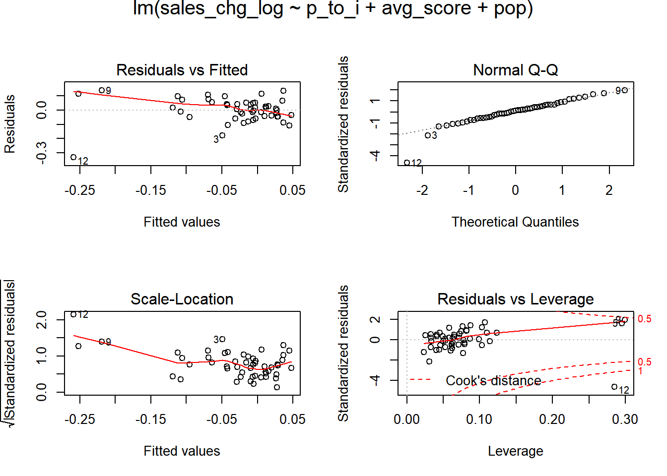
Not the cleanest of regression plots. However, the largest issues with residuals occur when the fitted estimates of sales are quite low.
Here is a look at the largest outlier states.
# major negative residuals

mod_augment %>%
  arrange(.resid) %>%
  as.data.frame() %>%
  .[1:10, c(1:5, 8)] %>%
  mutate_if(is.numeric, ~ round(.x, 2))
## state p_to_i avg_score sales_chg_log pop .resid
## 1 Hawaii 7.94 693 -0.59 14.17 -0.33
## 2 Arizona 3.95 669 -0.23 15.73 -0.18
## 3 Iowa 2.55 695 -0.06 14.95 -0.11
## 4 Utah 4.02 683 -0.15 14.91 -0.10
## 5 New Mexico 3.66 659 -0.11 14.55 -0.09
## 6 Kansas 2.67 680 -0.05 14.88 -0.09
## 7 North Carolina 3.25 666 -0.09 16.12 -0.08
## 8 Illinois 3.10 683 -0.08 16.37 -0.07
## 9 South Carolina 3.20 657 -0.06 15.40 -0.06
## 10 Idaho 3.97 681 -0.09 14.32 -0.06# major positive residuals
mod_augment %>%
arrange(-.resid) %>%
as.data.frame() %>%
.[1:10, c(1:5, 8)] %>%
mutate_if(is.numeric, ~ round(.x, 2))## state p_to_i avg_score sales_chg_log pop .resid
## 1 District of Columbia 7.37 670 -0.08 13.42 0.14
## 2 South Dakota 2.97 700 0.17 13.66 0.14
## 3 California 7.09 680 -0.14 17.48 0.11
## 4 Wyoming 3.55 678 0.12 13.28 0.11
## 5 Florida 4.07 668 0.04 16.83 0.11
## 6 New York 4.85 688 -0.02 16.80 0.10
## 7 Montana 4.33 689 0.05 13.84 0.10
## 8 Nevada 4.45 655 0.01 14.88 0.08
## 9 Massachusetts 4.98 699 -0.03 15.73 0.07
## 10 West Virginia 2.76 658 0.10 14.42 0.07We note that the states with the most extreme residuals are often at the highest or lowest end of the price to income spectrum.
Final regressions
Given the residual issues noted above and the lack of significance on state size and credit score, we will continue this analysis by specifying a another regression. Dropping variables is not the best correction for large outliers as those points often contain interesting information. There are other ways to continue to improve this regression beyond dropping outliers.
We will try to correct our outliers by using a more robust regression estimation process. Specifically we will use the MASS package’s rlm function to estimate an iterated re-weighted least squares. This should help us underweight the outliers.
next.mod <- rlm(sales_chg_log ~ p_to_i + avg_score + pop, data = mod.input.data)

opar <- par(mfrow = c(2, 2), oma = c(0, 0, 1.1, 0))

plot(next.mod)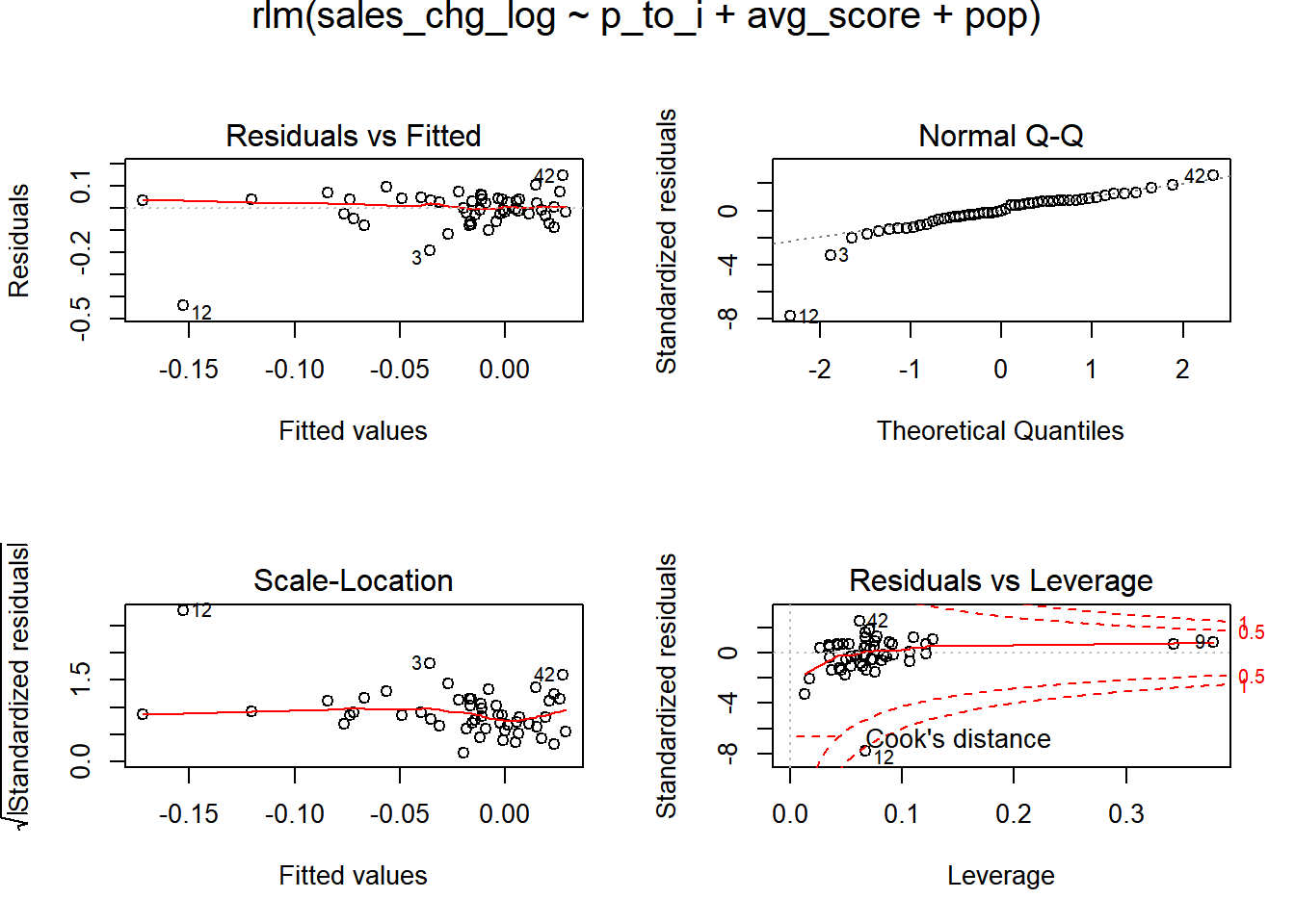
This method shows some improvement. Large outliers remain nevertheless. To provide a final look at the relationship between home sales activity and initial affordability, we will exclude a few high leverage points. Yes, this is not ideal. However, look at the 5 states which feature Cook’s distance values greater than \(4 / (N - K - 1)\).
mod_augment[mod_augment$.cooksd > 4 / (50 - 3 - 1),] %>%
  as.data.frame() %>%
  .[,c(1:5, 11)] %>%
  mutate_if(is.numeric, ~ round(.x, 2))
## state p_to_i avg_score sales_chg_log pop .cooksd
## 1 California 7.09 680 -0.14 17.48 0.27
## 2 District of Columbia 7.37 670 -0.08 13.42 0.40
## 3 Hawaii 7.94 693 -0.59 14.17 2.13Hawaii is a particularly egregious point. For the sake of better understanding how affordability has impacted home sales activity, we are going to focus only on the continental U.S. Sorry Alaska, forgotten again! We will use the robust estimation method and drop the uninformative credit score variable.
# filter for only the continent

fin.mod.data <- mod.input.data %>%
  filter(!state %in% c("Alaska", "Hawaii"))

fin.mod <- rlm(sales_chg_log ~ p_to_i + pop, data = fin.mod.data, method = "MM")

# model level summary

summary(fin.mod)
##
## Call: rlm(formula = sales_chg_log ~ p_to_i + pop, data = fin.mod.data,
## method = "MM")
## Residuals:
## Min 1Q Median 3Q Max
## -0.19547 -0.03298 0.00511 0.03516 0.14297
##
## Coefficients:
## Value Std. Error t value
## (Intercept) 0.3390 0.1379 2.4588
## p_to_i -0.0279 0.0088 -3.1788
## pop -0.0166 0.0088 -1.8759
##
## Residual standard error: 0.05961 on 46 degrees of freedom# coefficients ... price to income is still significant
tidy(fin.mod) %>%
mutate(p.value = c(f.robftest(fin.mod, var = "(Intercept)")$p.value,
f.robftest(fin.mod, var = "p_to_i")$p.value,
f.robftest(fin.mod, var = "pop")$p.value)) %>%
mutate_if(is.numeric, ~ round(.x, 3))## # A tibble: 3 x 5
## term estimate std.error statistic p.value
## <chr> <dbl> <dbl> <dbl> <dbl>
## 1 (Intercept) 0.339 0.138 2.46 0.018
## 2 p_to_i -0.028 0.009 -3.18 0.002
## 3 pop -0.017 0.009 -1.88 0.066# finally, a look at the residuals
opar <- par(mfrow = c(2, 2), oma = c(0, 0, 1.1, 0))
plot(fin.mod)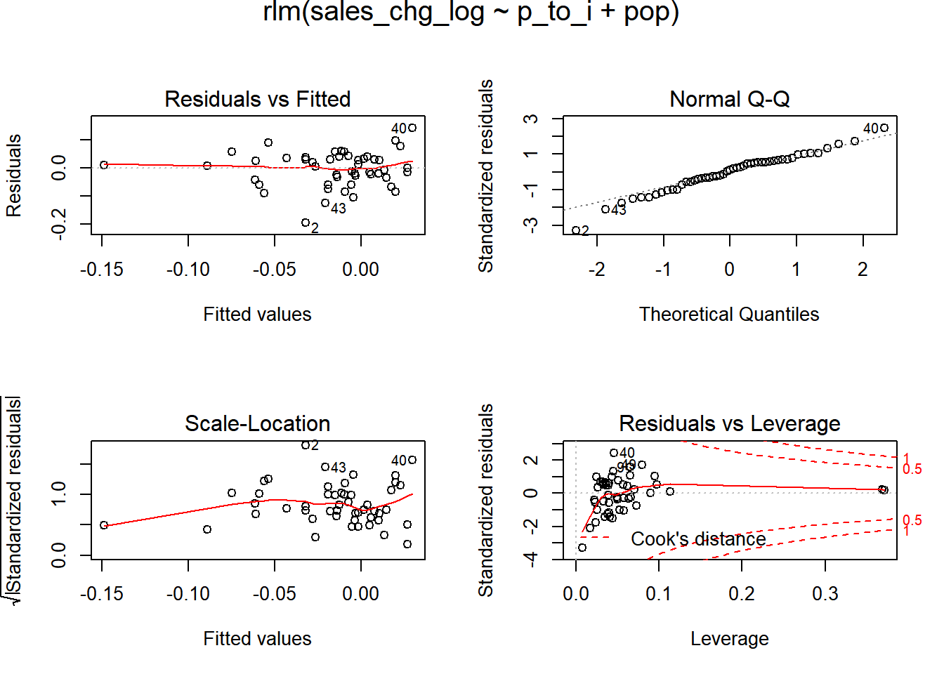
I ran another version of robust regression through the robustbase package. The function lmrob shows an adjusted \(R^{2}\) of 0.14.
Conclusion
Well, we’ve made it. We looked at the move in mortgage rates in 2018. We pulled in data on home sales activity, state-level credit scores, and population. We then worked a few models to try to understand the relationships that exist between these variables.
Cleaning up the regression for outliers and uninformative dependent variables shows that affrodability is indeed related to the decline in home sales activity in 2018. More expensive states have seen home sales fall more than more affordable states. That said, higher mortgage rates haven’t stunted home sales activity in all markets. In particular, natural resource heavy states (Alaska, Wyoming, North Dakota) and states across the South (Florida, Georgia, and Alabama) continue to see robust home purchase activity.