Last week we looked at Zillow’s home sales data to understand the recent slowdown. We concluded that affordability problems have indeed weighed a bit on the housing market. More expensive markets have cooled more than cheaper markets.
Sometimes one is better lucky than good. Last night, I encountered a fantastic introduction to a 2018 R bombshell: the package fable. Here is the video and here are the slides from Mitch and Rob’s presentation. Big thanks are due to them and Earo Wang, cited for her wonderful work on the tsibble package.
This post is all about test driving fable. Luckily Zillow publishes unadjusted home sales estimates. We use the raw sales counts data from Zillow to try out the new time series titan!
Start with import & processing
# you might need library(devtools) then install_github("tidyverts/fable") & install_github("tidyverts/tsibbledata")

library(fable)
library(tsibbledata)
library(tidyverse)
library(scales)
library(janitor)

# import zillow data

zillow.import <- read_csv("http://files.zillowstatic.com/research/public/State/Sale_Counts_State.csv")

# process zillow data

zillow.processed <- zillow.import %>%
  janitor::clean_names() %>%
  select(-region_id, -size_rank) %>%
  gather(date, value, x2008_03:ncol(.)) %>%
  mutate(date = str_remove(date, "x"),
         date = lubridate::ymd(paste0(gsub("_", "-", date), "-01")),
         region_name = tolower(region_name))

# visual check for seasonality

zillow.processed %>%
  filter(region_name %in% "california") %>%
  ggplot(aes(date, value)) +
  geom_line()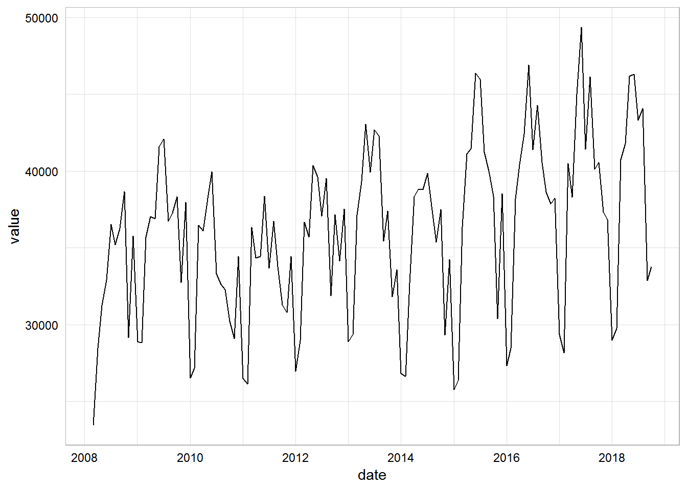
Maiden fable … Mable?
Looks good. Now we can try out fable. First we need to create a tsibble object.
zillow.tsib <- zillow.processed %>%
  mutate(date = yearmonth(date)) %>%  # IMPORTANT mutation, took a few tries to get right
  as_tsibble(key = id(region_name),
             index = date)

zillow.tsib
## # A tsibble: 6,400 x 3 [1M]
## # Key: region_name [50]
## region_name date value
## <chr> <mth> <dbl>
## 1 alabama 2008 Mar 3347
## 2 alabama 2008 Apr 3664
## 3 alabama 2008 May 3667
## 4 alabama 2008 Jun 3863
## 5 alabama 2008 Jul 3879
## 6 alabama 2008 Aug 3614
## 7 alabama 2008 Sep 3448
## 8 alabama 2008 Oct 3233
## 9 alabama 2008 Nov 2253
## 10 alabama 2008 Dec 2763
## # ... with 6,390 more rowsThis is super cool! We have a new clean ts() object in tidy format.
Test driving in California
Now we can produce a few plots for the historical fit.
# fit a simple ETS model

cal.fit <- zillow.tsib %>%
  filter(region_name %in% "california") %>%
  fable::ETS(log(value) ~ season("A"))

# now we can plot the actual versus the fitted

cal.fit %>%
  augment() %>%
  select(-.resid) %>%
  rename(home_sales = `log(value)`) %>%
  gather(type, value, home_sales:.fitted) %>%
  mutate(value = exp(value)) %>%
  ggplot(aes(date, value, color = type, alpha = type)) +
  geom_line(size = 1) +
  geom_smooth(aes(group = 1),
              method = "lm",
              se = FALSE,
              color = "black",
              size = 0.3,
              linetype = "dashed") +
  scale_y_continuous(labels = scales::comma) +
  scale_color_manual(values = c("dodgerblue4", "darkolivegreen")) +
  scale_alpha_manual(values = c(0.75, 1.0),
                     guide = FALSE) +
  labs(x = "",
       y = "Home Sales Unadjusted",
       title = "Fitting an historical model to California home sales",
       subtitle = "ETS(M,Ad,A) fit on Zillow's all home sales data since 2008",
       caption = "verbumdata.netlify.com\nSource:Zillow") +
  theme(legend.title = element_blank(),
        legend.position = "top")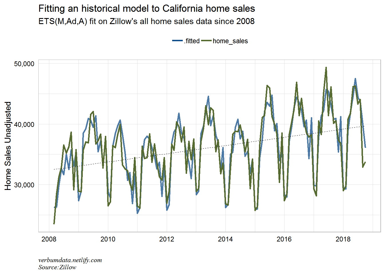
# finally we can look at the decomposed time series

cal.fit %>%
  components() %>%
  gather(component, value, level, slope, season) %>%
  ggplot(aes(x = date, y = value)) +
  geom_line() +
  facet_grid(vars(component), scales = "free_y")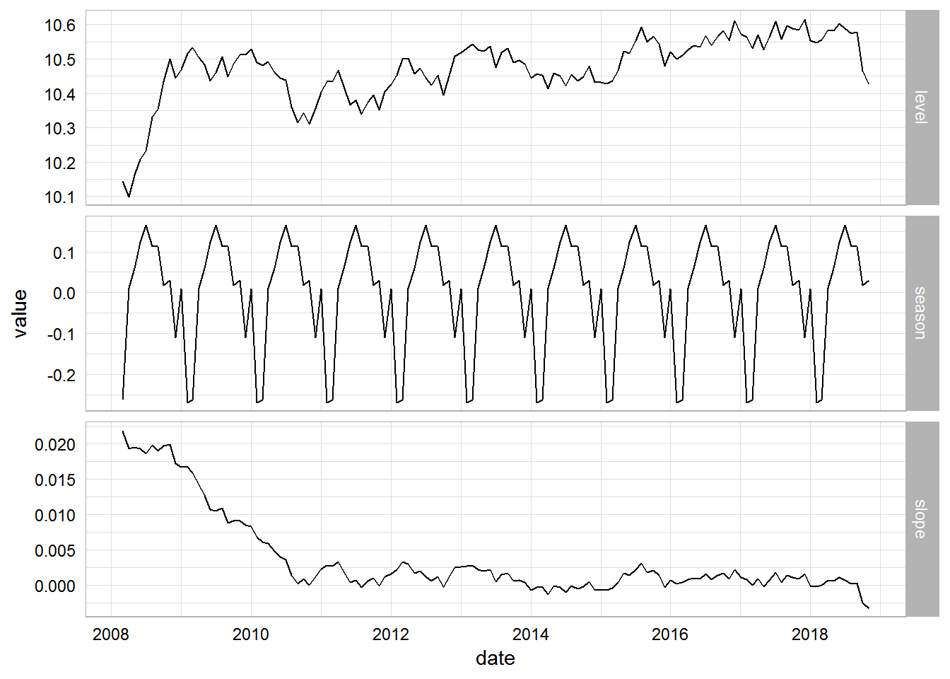
No modeling process would be complete without studying accuracy. I had some issues with the fable::accuracy function in fable. I wouldn’t be surprised to learn this was largely user error. But that is why you see the cumbersome calls to data structures underlying the model object.
# look at residuals

cal.fit$model[[1]]$est$.resid %>% forecast::checkresiduals()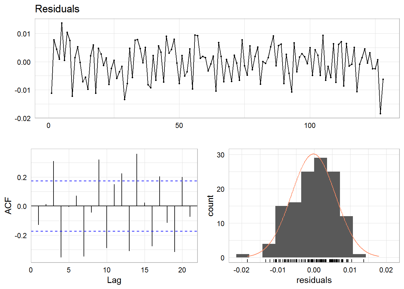
# look at accuracy

cal.fit$model[[1]]$fit
## # A tibble: 1 x 9
## method period sigma logLik AIC AICc BIC MSE AMSE
## <chr> <dbl> <dbl> <dbl> <dbl> <dbl> <dbl> <dbl> <dbl>
## 1 ETS(M,Ad,A) 12 0.00651 42.3 -48.7 -42.4 2.66 0.00404 0.00484This isn’t the best model ever fit. The residuals are fairly normally distributed. But our ACF plot shows that a real analysis would need more transformations. Note the latest two (major negative) residuals, though. We can clearly see the surprise in California home sales.
Let’s now make a forecast!
# add in the forecast piece

cal.fit.fc <- cal.fit %>%
  forecast(h = 12)

# plot

zillow.tsib %>%
  filter(region_name %in% "california") %>%
  ggplot(aes(date, value)) +
  geom_line(color = "darkolivegreen", size = 1) +
  geom_forecast(aes(ymin = lower, ymax = upper, level = level),
                fortify(cal.fit.fc), stat = "identity") +
  scale_y_continuous(labels = scales::comma) +
  scale_x_date(date_breaks = "1 year", date_labels = "%Y") +
  labs(x = "",
       y = "Home Sales Unadjusted",
       title = "Forecasting California home sales with an ETS model",
       subtitle = "ETS(M,Ad,A) fit on Zillow's all home sales data since 2008 + forecast",
       caption = "verbumdata.netlify.com\nSource:Zillow") +
  theme(legend.position = "top")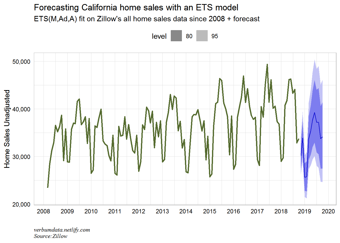
Pretty interesting here. The model sees 2019 getting back to only ~39,000 home sales in the peak month of activity (June). That peak would be the lowest since 2011! The top end of the model estimate gets us back only to 2017’s peak. The trend does not appear to be a home seller’s friend in the Golden State.
In the future, maybe we can look at modeling many states. Thanks to Mitch and Rob (and others I’m sure!) for this pkg. Lots more to explore and learn.