Today I thought we’d do a little web scraping. In particular, we will look at the trends afoot in the quick service restaurant (QSR) category.
Our data comes from QSR magazine’s top 50 list. We will look back each year since 2012 and tally the results.
Set up for scraping
Here we will set our colors, our links, and the years. Small differences in the way QSR magazine formats their data tables meant that a functional approach wouldn’t have worked very well. As a result, you’ll see the repetitive execution of similar functions.
We will now use our links to pull data from each year. numcleanr helps us remove the pesky dollar signs and turn these tables into useful items. There is lots of boring code here, you might want to skip down to the cool figures!
# pull data for 2017

year_zero <- read_html(links[1]) %>%
  html_nodes("table") %>%
  html_table(header = TRUE) %>%
  bind_rows() %>%
  setNames(c("rank","company","category","sys_sales","auv","units_franch","units_owned","units_total","unit_chg_year")) %>%
  mutate(company = tolower(str_replace_all(company, "[:punct:]|[0-9]",""))) %>%
  mutate(category = tolower(category)) %>%
  mutate(year = years[1]) %>%
  mutate_at(vars(-company,-category), funs(numclean_us))
## Warning: funs() is soft deprecated as of dplyr 0.8.0
## please use list() instead
##
## # Before:
## funs(name = f(.)
##
## # After:
## list(name = ~f(.))
## This warning is displayed once per session.this_year <- read_html(links[2]) %>%
html_nodes("table") %>%
html_table(header = TRUE) %>%
bind_rows() %>%
setNames(
c("rank","company","chg_rank","category","sys_sales","auv","units_franch","units_owned","units_total","unit_chg_year")) %>%
select(-c(chg_rank)) %>%
mutate(company = tolower(str_replace_all(company, "[:punct:]|[0-9]",""))) %>%
mutate(category = tolower(category)) %>%
mutate(year = years[2]) %>%
mutate_at(vars(-company,-category), funs(numclean_us))
# pull data for 2015
last_year <- read_html(links[3]) %>%
html_nodes("table") %>%
html_table(header = TRUE) %>%
bind_rows() %>%
setNames(
c("rank","company","sys_sales","auv","units_franch","units_owned","units_total","unit_chg_year")) %>%
mutate(company = tolower(str_replace_all(company, "[:punct:]|[0-9]",""))) %>%
mutate(year = years[3]) %>%
mutate_at(vars(-company), funs(numclean_us)) %>%
left_join(this_year[,c("company","category")], by = "company")
# pull data for 2014
two_year <- read_html(links[4]) %>%
html_nodes("table") %>%
html_table(header = TRUE) %>%
bind_rows() %>%
setNames(
c("rank","company","sys_sales","auv","units_franch","units_owned","units_total","unit_chg_year")) %>%
mutate(company = tolower(str_replace_all(company, "[:punct:]|[0-9]",""))) %>%
mutate(year = years[4]) %>%
mutate_at(vars(-company), funs(numclean_us)) %>%
left_join(this_year[,c("company","category")], by = "company")
# pull data for 2013
three_year <- read_html(links[5]) %>%
html_nodes("table") %>%
html_table(header = TRUE) %>%
bind_rows() %>%
setNames(
c("rank","company","sys_sales","auv","units_franch","units_owned","units_total","unit_chg_year")) %>%
mutate(company = str_trim(tolower(str_replace_all(company, "[:punct:]|[0-9]","")))) %>%
mutate(year = years[5]) %>%
mutate_at(vars(-company), funs(numclean_us)) %>%
left_join(this_year[,c("company","category")], by = "company") %>%
mutate(rank = row_number())## Warning in function_list[[k]](value): NAs introduced by coercion# pull data for 2012
four_year <- read_html(links[6]) %>%
html_nodes("table") %>%
html_table(header = TRUE) %>%
bind_rows() %>%
setNames(
c("rank","segment","company","sys_sales","auv","units_franch","units_owned","units_total","unit_chg_year")) %>%
mutate(company = str_trim(tolower(str_replace_all(company, "[:punct:]|[0-9]","")))) %>%
mutate(year = years[6]) %>%
mutate_at(vars(-company,-segment), funs(numclean_us)) %>%
left_join(this_year[,c("company","category")], by = "company") %>%
mutate(rank = row_number()) %>%
mutate(segment = case_when(
str_detect(segment, "pizza") ~ "pizza",
TRUE ~ segment)) %>%
mutate(category = case_when(
is.na(category) ~ segment,
TRUE ~ category)) %>%
select(-segment)Brutal. But it is done.
Cleaning the data and plotting
Great news. We have all of our annual QSR data. Now we must put it together. I recently watched David Robinson’s #tidytuesday screencast for dolphin data. I could have used his fuzzyjoin package to sort the categories. Instead we just use a dplyr::case_when.
# put it all together

qsr_data <- bind_rows(year_zero, this_year, last_year, two_year, three_year, four_year) %>%
  mutate(company = str_trim(str_replace_all(company, "pizza| sandwiches", ""))) %>%
  mutate(company = ifelse(company == "hut", "pizza hut", company)) %>%
  mutate(category = case_when(
    str_detect(company, "dominos")           ~ "pizza",
    str_detect(company, "jimmy johns")       ~ "sandwich",
    str_detect(company, "sonic|five guys")   ~ "burger",
    str_detect(company, "krispy kreme")      ~ "snack",
    str_detect(company, "qdoba|chipotle")    ~ "ethnic",
    str_detect(company, "long john silvers") ~ "seafood",
    str_detect(company, "quiznos")           ~ "sandwich",
    str_detect(company, "einstein bros")     ~ "snack",
    TRUE ~ category)) %>%
  group_by(company) %>%
  arrange(year) %>%
  mutate(chg_auv = auv - lag(auv))

# create a category data frame

by_cat <- qsr_data %>%
  group_by(year,category) %>%
  summarize_at(vars(sys_sales:units_total), funs(mean)) %>%
  gather(indicator, value, sys_sales:units_total)
Let’s look at the trends afoot across categories and indicators. First we need to create a time series data frame.
# time series

over_time <- by_cat %>%
  ungroup(year) %>%
  filter(indicator != "units_owned") %>%
  mutate(year = as.character(year)) %>%
  mutate(indicator = case_when(
    indicator == "auv" ~ "Average Unit Sales (Thousands)",
    indicator == "sys_sales" ~ "Average U.S. Systemwide Sales (Millions)",
    indicator == "units_franch" ~ "Average Franchised Unit Count",
    indicator == "units_total" ~ "Average Total Unit Count")) %>%
  mutate(indicator = factor(indicator,
                            levels = c("Average U.S. Systemwide Sales (Millions)",
                                       "Average Unit Sales (Thousands)",
                                       "Average Total Unit Count",
                                       "Average Franchised Unit Count"))) %>%
  mutate(label = if_else(year == "2017", as.character(category), NA_character_),
         label = if_else(category == "seafood" & year == "2016", as.character(category), label))
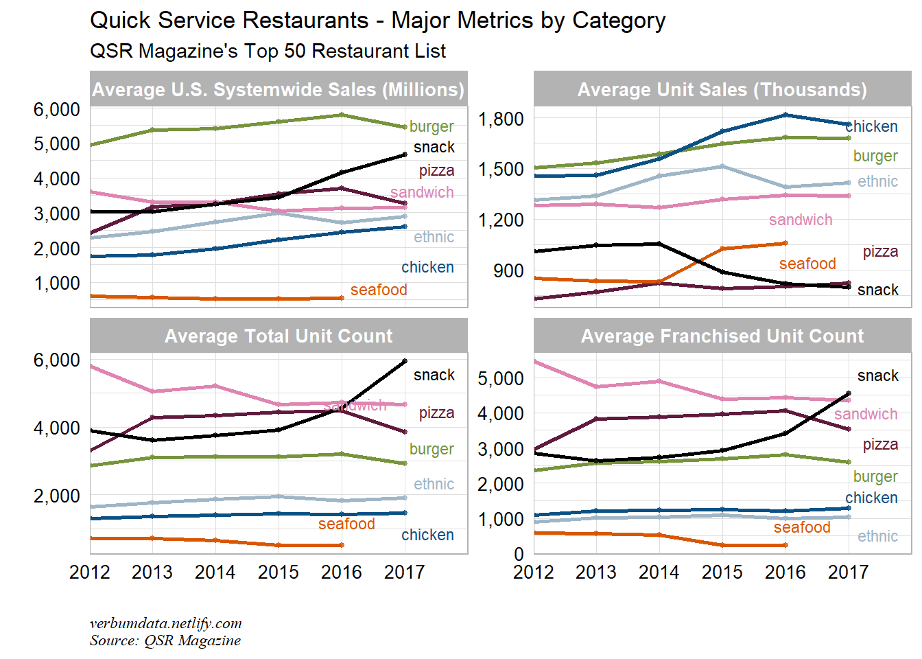
Here is the official time series plot.
ggplot(over_time, aes(year, value, group = category, color = category)) +
  geom_line(size = 1) +
  geom_point(size = 1, alpha = 0.75) +
  scale_x_discrete(expand = c(0,0,0.2,0)) +
  scale_y_continuous(labels = scales::comma_format()) +
  geom_label_repel(aes(label = label),
                   nudge_x = 1,
                   na.rm = TRUE,
                   segment.color = NA,
                   label.size = NA,
                   fill = NA,
                   size = 3,
                   force = 2) +
  facet_wrap(~ indicator, scales = "free_y") +
  scale_colour_manual(values = rand_cols) +
  guides(color = FALSE) +
  labs(x = "",
       y = "",
       title = "Quick Service Restaurants - Major Metrics by Category",
       subtitle = "QSR Magazine's Top 50 Restaurant List",
       caption = "verbumdata.netlify.com\nSource: QSR Magazine") +
  theme(strip.text.x = element_text(size = 10, face = "bold"),
        axis.text = element_text(size = 10, color = "black"),
        legend.position = "top")
Pretty neat time series across four indicators. Here’s what stands out to me:
- Snack’s systemwide sales have been growing strongly for the past few years. This is largely driven by unit count growth
- Chicken has the best average unit sales, and snack has the lowest.
- Sandwich unit counts are down nearly -17% in the past 5 years. Subway != fresh.
Off the chain
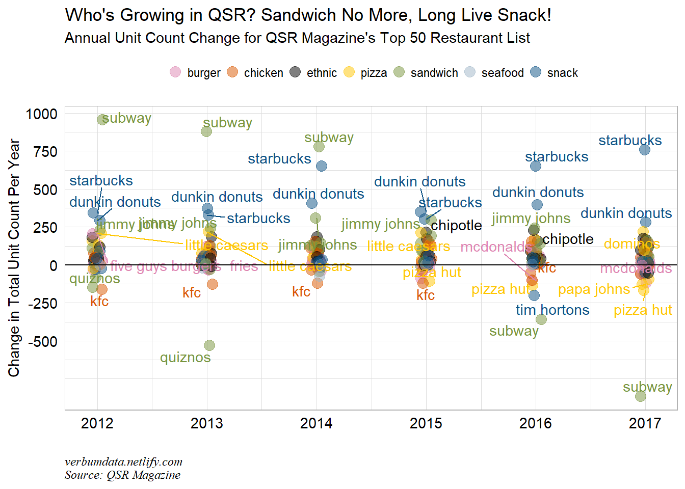
At the category level, we pulled out some interesting stories. Now let’s look directly at the concepts driving the changes.
Let’s first look at unit count.
ggplot(qsr_data, aes(year, unit_chg_year, color = category)) +
  geom_jitter(width = 0.05, size = 3.5, alpha = 0.5) +
  geom_text_repel(data = qsr_data %>% filter(unit_chg_year < -100 | unit_chg_year > 200),
                  aes(year, unit_chg_year, label = company),
                  show.legend = FALSE) +
  geom_hline(yintercept = 0) +
  scale_color_manual(values = rand_cols[c(5:8,1,3,2)]) +
  scale_y_continuous(breaks = seq(-500, 1000, 250), labels = seq(-500, 1000, 250)) +
  labs(x = "",
       y = "Change in Total Unit Count Per Year",
       title = "Who's Growing in QSR? Sandwich No More, Long Live Snack!",
       subtitle = "Annual Unit Count Change for QSR Magazine's Top 50 Restaurant List",
       caption = "verbumdata.netlify.com\nSource: QSR Magazine") +
  theme(axis.text = element_text(size = 11, color = "black"),
        plot.caption = element_text(size = 9, face = "italic", hjust = 0),
        legend.position = "top",
        legend.title = element_blank()) +
  guides(color = guide_legend(nrow = 1))
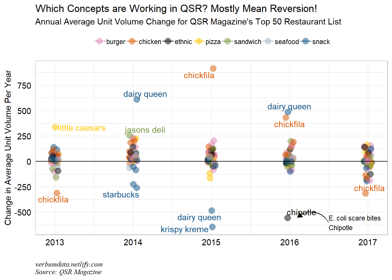
Finally we will look at AUV (average unit volumes). This measure reports annual sales volume the average store pulled in.
ggplot(qsr_data %>% filter(year != "2012"), aes(year, chg_auv, color = category)) +
  geom_jitter(width = 0.05, size = 3.5, alpha = 0.5) +
  geom_hline(yintercept = 0) +
  geom_text_repel(data = qsr_data %>% filter(chg_auv < -250 | chg_auv > 250),
                  aes(year, chg_auv, label = company),
                  show.legend = FALSE) +
  geom_curve(aes(x = 2016.5,
             xend = 2016.1,
             y = -600,
             yend = -550),
             arrow = arrow(length = unit(0.03, "npc"),
                           type = "closed")) +
  annotate(geom = "text",
           x = 2016.5,
           y = -600,
           label = "E. coli scare bites\nChipotle",
           hjust = 0,
           size = 3) +
  scale_color_manual(values = rand_cols[c(5:8,1,3,2)]) +
  scale_y_continuous(breaks = seq(-500, 900, 250), labels = seq(-500, 900, 250)) +
  labs(x = "",
       y = "Change in Average Unit Volume Per Year",
       title = "Which Concepts are Working in QSR? Mostly Mean Reversion!",
       subtitle = "Annual Average Unit Volume Change for QSR Magazine's Top 50 Restaurant List",
       caption = "verbumdata.netlify.com\nSource: QSR Magazine") +
  theme(axis.text = element_text(size = 11, color = "black"),
        plot.caption = element_text(size = 9, face = "italic", hjust = 0),
        legend.position = "top",
        legend.title = element_blank()) +
  guides(color = guide_legend(nrow = 1))
## Warning: Removed 16 rows containing missing values (geom_point).
What mostly pops out in this chart is the mean reversion. Chick-fil-a had a big year in 2015, but then fell for the following two years. We also see Dairy Queen bouncing back and forth in 2014-2016. Otherwise, only Chipotle’s food scare really pops out as notable.
Hopefully, dear reader, you found this edifying. The scraping code and the plots all come for free.