In early January your author visited Seattle. Gracious friends made superb hosts. The visit was among only a few I’ve made to Cloud City.
Seattle revealed a deep dynamism. I immediately wanted to better understand how this has evolved over the years. In one’s own city, patterns of city evolution are intuitive. In another city, a friend’s recollections are wonderful, but data put a finer point on the where and the how of urban growth.
Single family building permits data is the portal I chose to observe Seattle’s evolution. In this post I explore single family building activity across Seattle and across time. Fortunately for us, the city of Seattle maintains an open data platform with myriad datasets, calendars, and much more to help in our quest for context. Curious readers will find that information here.
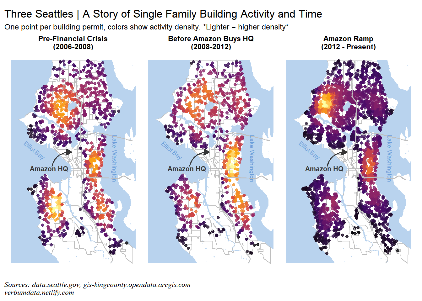
This is the plot toward which we will be working!

Accessing and assessing the data
Our first step is loading libraries, setting options, importing and processing data.
library(data.table); library(tidyverse)
library(patchwork);  library(janitor)
library(lubridate);  library(tigris)
library(sf);         library(pdftools)

# set options

theme_set(theme_light(base_size = 11) +
            theme(axis.ticks = element_blank(),
                  axis.text = element_text(color = "black",
                                           family = "sans"),
                  plot.caption = element_text(family = "serif",
                                              face = "italic", hjust = 0)))

options(tigris_use_cache = TRUE, tigris_class = "sf")

# import

import <- fread("https://data.seattle.gov/api/views/76t5-zqzr/rows.csv?accessType=DOWNLOAD") %>%
  clean_names()

# process imported data

permit_proc <- import %>%
  clean_names() %>%
  mutate_at(vars(contains("date")), ymd) %>%
  mutate_if(is.character, tolower) %>%
  mutate(year = year(issued_date)) %>%
  filter(issued_date > "2005-12-31",
         issued_date < "2019-01-01",
          year < 2018 & !is.na(completed_date) |
          year == 2018)
Since we are interested in trends in single family housing, we must further clean our data set. The main items to do here are:
- For additions/alterations, we will filter all permits with an estimated project cost below the 99th percentile. This way we limit our sample to those additions/alterations most likely to add living space.
- For new permits, we exclude only those with estimated project costs below the 5th percentile.
- We must limit our sample to only those permits with latitude/longitude observations.
# look only at single family additions/new

single_filter <- permit_proc %>%
  filter(permit_class %in% "single family/duplex" &
         permit_type_desc %in% c("addition/alteration", "new"))

# establish thresholds

single <- single_filter %>%
  mutate(of_interest = case_when(
    permit_type_desc == "addition/alteration" &
      est_project_cost > quantile(est_project_cost, 0.99, na.rm = T) ~ 1,
    permit_type_desc == "new" &
      est_project_cost > quantile(est_project_cost, 0.05, na.rm = T) ~ 1,
    TRUE ~ 0)) %>%
  filter(of_interest == 1,
         !is.na(longitude),
         !is.na(latitude))
Geographic adventures
With our raw data processed, we move now to implementing our geographic items. We must begin by transforming the numeric latitude and longitude columns into usable coordinates on a map.
# set as sf object

single_sf <- st_as_sf(single,
                      coords = c("longitude", "latitude"),
                      crs = 4326)
# extract coordinates

special_coords <- st_coordinates(single_sf)

# append to data frame

single_sf_all <- single_sf %>%
  mutate(longitude_point = special_coords[,1],
         latitude_point = special_coords[,2])
Now we need to build our general map elements. This starts with the Seattle geography. I used a PDF from seattle.gov to extract the Census tracts of interest. We can then pull those from the PDF to filter our shapefile pull.
# get tracts of interest from PDF,

seattle_tracts <- pdf_text("https://bit.ly/2DFoWb5")

# match tract numbers

tract_no <- regmatches(seattle_tracts,
                       gregexpr("[[:digit:]]+\\.*[[:digit:]]*",
                       seattle_tracts)) %>%
  unlist() %>%
  .[!grepl("2010", .)] %>% # filter the year on the page
  as.numeric() %>%
  .[. < 1000] %>% # drop the region categories
  as.character() # keep decimals where relevant

# pull tract shapefile source data from tigris

king_county <- tigris::tracts(state = "WA",
                              county = "King",
                              cb = TRUE)

# extract only relevant tracts

tracts_plot <- king_county %>%
  filter(NAME %in% tract_no)
We now have the raw data for building our map. Any visitor to Seattle knows that Census tracts won’t cover the most important geographic feature of the city: water. We must pull in water shapefiles.
It was tough slogging until I encountered this wonderful package/dataset pulled together by James Bain. After a lil’ ask on Twitter, he kindly posted the Seattle water shapefiles. Unfortunately, the shapefile was incomplete and I had to go elsewhere for the GIS supply.
Readers looking for those resources will find them here: Seattle water shapefile and the Seattle roads shapefile
# read in shapefiles saved down for convenience

seattle_water <- readRDS("../../static/2019-01-28_seattle-water-data.rds")

seattle_roads <- readRDS("../../static/2019-01-28_seattle-roads-data.rds") %>%
  filter(ARTDESCRIP %in% c("Interstate/Freeway",
                           "State Route/Freeway"))

# filter map areas

map_box <-  c(xmin = -122.45, ymin = 47.485, xmax = -122.222, ymax = 47.735)
water_sub <- st_crop(seattle_water, map_box)
road_sub <- st_crop(seattle_roads, map_box)
Putting it all together
With the data and the geographic information in hand we turn finally to our plot. I chose to use geographic density as a means of highlighting activity for the Seattle building permits data. I found a helpful density function written by Kamil Slowikowski. This allows us to show, across two dimensions, the areas of highest density for building permit activity.
# helpful density function

get_density <- function(x, y, ...) {
  dens <- MASS::kde2d(x, y, ...)
  ix <- findInterval(x, dens$x)
  iy <- findInterval(y, dens$y)
  ii <- cbind(ix, iy)
  return(dens$z[ii])}
We also need to segment our analysis by year, though. In particular, we describe Seattle’s evolution over the past decade and a half with 3 major epochs:
- Pre-Financial Crisis (2006-2008): The housing market boomed, but Seattle’s hyper-growth hadn’t kicked off
- Amazon Purchases its Seattle HQ Campus: Until this time, Amazon was growing rapidly, but the U.S. economy was still recovering
- The Ramp after Amazon’s Purchase: Amazon kicks into hyperspeed, Seattle booms
The Seattle Times provided fantastic coverage of our second epochal split.
seattle_dense <- single_sf_all %>%
  mutate(epoch = case_when(
    year < 2008 ~ "Pre-Financial Crisis\n(2006-2008)",
    year >= 2008 & year < 2012 ~ "Before Amazon Buys HQ\n(2008-2012)",
    year >= 2012 ~ "Amazon Ramp\n(2012 - Present)")) %>%
  mutate(epoch = factor(epoch,
                        levels = c("Pre-Financial Crisis\n(2006-2008)",
                                   "Before Amazon Buys HQ\n(2008-2012)",
                                   "Amazon Ramp\n(2012 - Present)"))) %>%
  group_by(epoch) %>%
  mutate(density = get_density(longitude_point, latitude_point))
With our data segmented, we can now present our plot! We will do this with a purrr::map function because we will end up wanting facet specific annotations. The patchwork package makes this easy.
# subtitle & caption

st <- "One point per building permit, colors show activity density. *Lighter = higher density*"
cap <- "Sources: data.seattle.gov, gis-kingcounty.opendata.arcgis.com\nverbumdata.netlify.com"

# Generate standard plots

seattle_plots <- map(unique(seattle_dense$epoch), ~
                      ggplot() +
    geom_sf(data = tracts_plot, color = "grey", alpha = 0) +
    geom_sf(data = water_sub, fill = "slategray2", color = NA) +
    geom_point(data = seattle_dense %>% filter(epoch == .x),
             aes(x = longitude_point,
                 y = latitude_point,
                 color = density),
                 size = 1.5,
             alpha = 0.8) +
    geom_sf(data = road_sub, color = "grey") +
    geom_curve(data = tracts_plot,
             aes(x = -122.375, y = 47.604, xend = -122.339, yend = 47.6215),
             color = "#353535",
             curvature = -0.4,
             size = 0.70,
             ncp = 10,
             arrow = arrow(type = "closed",
                           length = unit(0.25, "cm"))) +
    annotate("text",
           x = -122.38, y = 47.6017,
           label = "Amazon HQ",
           color = "#353535",
           size = 2.9,
           fontface = 2) +
    annotate("text",
           x = -122.407, y = 47.624,
           label = "Elliot Bay",
           angle = 320,
           color = "#6a9dd9",
           size = 2.5) +
    annotate("text",
           x = -122.26, y = 47.614,
           label = "Lake Washington",
           angle = 270,
           color = "#6a9dd9",
           size = 2.5) +
  coord_sf(datum = NA) +
  scale_color_viridis_c(option = "inferno") +
  theme_void() +
  guides(color = FALSE) +
  facet_wrap(~ epoch) +
  theme(strip.text = element_text(face = "bold"),
        plot.caption = element_text(family = "serif",
                                   face = "italic",
                                   hjust = 0)))

# patchwork together primary plot

seattle_plots[[3]] +
  labs(title = "Three Seattles | A Story of Single Family Building Activity and Time",
       subtitle = st,
       caption = cap) +
  theme(plot.subtitle = element_text(size = 9)) +
seattle_plots[[2]] +
seattle_plots[[1]]
An amazing display, in our humble opinion. Readers will immediately notice the gravity shift over time. In the first epoch, West Seattle was the hottest spot. The city’s eastern edge was also active, as was Phinney Ridge.
In the second epoch activity shifted noticeably east. Leschi, the Central District, Madrona, and Capitol Hill were hotbeds of single family activity. In the past 6 years, we see the shift once again to Ballard. The industrial revitalization has brought surging single family home activity with it.
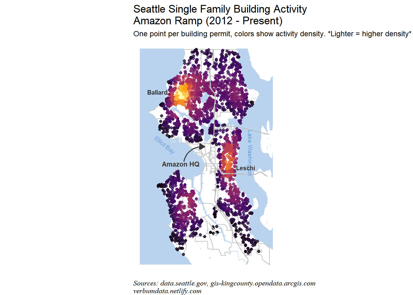
To close the lengthy post, we can look more closely at the latest facet: Amazon’s Ramp (2012 - Present).
seattle_plots[[1]] +
  labs(title = "Seattle Single Family Building Activity\nAmazon Ramp (2012 - Present)",
       subtitle = st,
       caption = cap) +
  theme(strip.text = element_blank(),
        plot.subtitle = element_text(size = 9)) +
  annotate("text",
           x = -122.42, y = 47.685,
           label = "Ballard",
           color = "#353535",
           size = 2.7,
           fontface = 2) +
  annotate("text",
           x = -122.269, y = 47.5975,
           label = "Leschi",
           color = "#353535",
           size = 2.7,
           fontface = 2)
This plot reveals the hot spots for single family building in Seattle in the past 6 years. Ballard and Leschi are two booming neighborhoods for single family housing activity. Where will activity go next? Considering the limited activity in the Northeast segment of the city (directly east of Ballard on the east side of the 5) across all our periods, your author would place his bets there.