This little missive was inspired by the cool presentation that Jake Flancer put together for #RITSAC. The main effort is to demonstrate just how closely NHL scoring fits a Poisson distribution.
If nothing else, it’s worth reviewing Jake’s work as it contains a host of interesting Poisson & hockey resources.
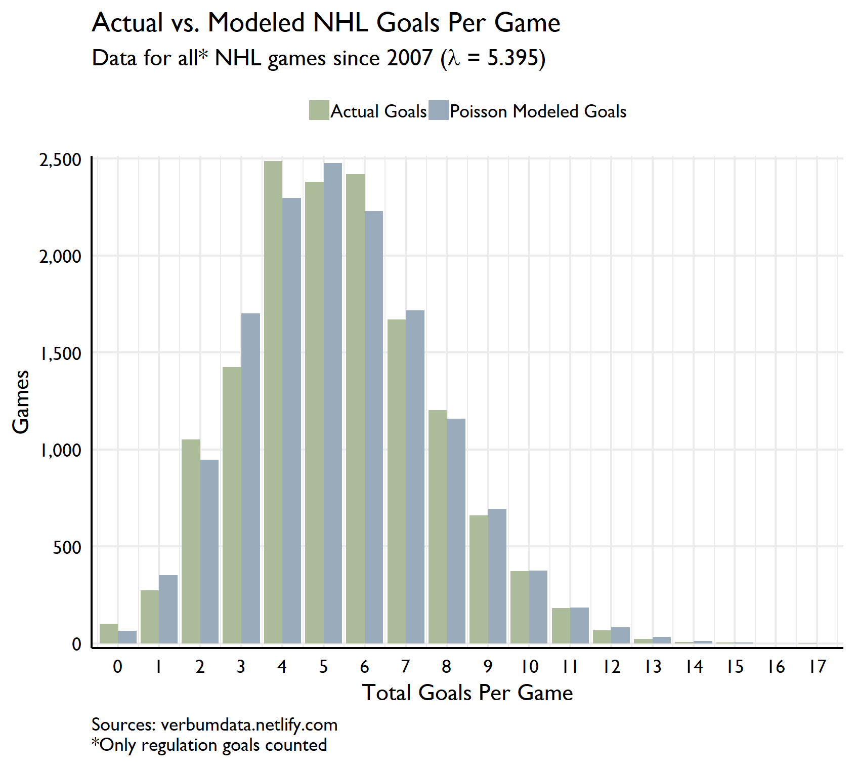
Here’s the plot we’re after!
The analysis
Jake helpfully put the NHL game data he scraped in the Github repo. That makes importing a snap.
# load libraries

library(data.table)
library(tidyverse)
library(extrafont)

nhl_games <- fread("https://github.com/jflancer/gameModel/raw/master/nhlgamedata.csv")
2019-09-15 16:57 FINAL UPDATE: Final fix to put the goal count right!
2019-09-15 16:08 UPDATE: Rough fix to ensure all goals for and against are per 60 min
2019-09-15 15:36 UPDATE: Jake makes the point on Twitter that we should filter OT games. The mean actually rises as we reduce game count
Jake once again helps out. Rather than drop OT games, what we’ve done here is ensure that all goals for and against reflect the end-of-60 score. The mean (lambda) falls back to the original 5.512 with games added back.
WE HAVE FIXED THE GAME DATA BY SHAMELESSLY ADAPTING JAKE’S CODE! MUCH CLEANER NOW!
# isolate OT games and create a new OT wins category

ot_games <- nhl_games[otLosses == 1] %>%
  .[, "gameId"] %>%
  unique() %>%
  .[, c("otWins", "otLosses") := .(1, 0)]

# rejoin OT games with original with adjusted goalsFor and goalsAgainst

clean_nhl_games <- merge(nhl_games, ot_games, all.x = TRUE, by = c("gameId", "otLosses")) %>%
  .[, ':='(otWins = fifelse(is.na(otWins), 0, 1))] %>%
  .[, ':='(goalsFor = goalsFor - otWins + shootoutGamesWon)] %>%
  .[, ':='(goalsAgainst = goalsAgainst - otLosses + shootoutGamesLost)]
Now all we need to do is summarize our data for total goals, pull some stats and plot.
# calculate goals per game

gpg <- unique(clean_nhl_games, by = "gameId") %>%
  .[, .(gpg = goalsAgainst + goalsFor), by = "gameId"]

# grab average goals per game

sum_stats <- summary(gpg$gpg)
There is a bit of a skew in the data with the mean slightly higher than the median. But onto the counts.
# now lets create a custom df to show actual gpg and predicted

gpg_count <- gpg[, .N, by = "gpg"] %>%
  .[order(gpg)] %>%
  .[, pois := dpois(gpg, sum_stats[["Mean"]]) * sum(N)]

# clean up names

setnames(gpg_count, old = c("N", "pois"), new = c("Actual Goals", "Poisson Modeled Goals"))
With our data prepped and ready, all we need to do is to plot!
gpg_count %>%
  gather(type, value, -gpg) %>%
  ggplot(aes(gpg, value, fill = type)) +
  geom_bar(stat = "identity", position = "dodge") +
  scale_fill_manual(values = c("#acbc9a", "#9aacbc")) +
  scale_x_continuous(breaks = seq(0, max(gpg$gpg), 1), expand = c(0.01,0.01)) +
  scale_y_continuous(expand = c(0.01,0), labels = scales::comma) +
  labs(x = "Total Goals Per Game",
       y = "Games",
       title = "Actual vs. Modeled NHL Goals Per Game",
       subtitle = expression(paste("Data for all* NHL games since 2007 (", lambda, " = 5.395)")),
       caption = 'Sources: verbumdata.netlify.com\n*Only regulation goals counted') +
  theme_minimal(base_family = "Gill Sans MT") +
  theme(axis.line = element_line(color = "black"),
        axis.text = element_text(color = "black"),
        legend.position = "top",
        legend.title = element_blank(),
        legend.key.size = unit(0.75, "line"),
        panel.grid.minor.y = element_blank(),
        plot.caption = element_text(hjust = 0))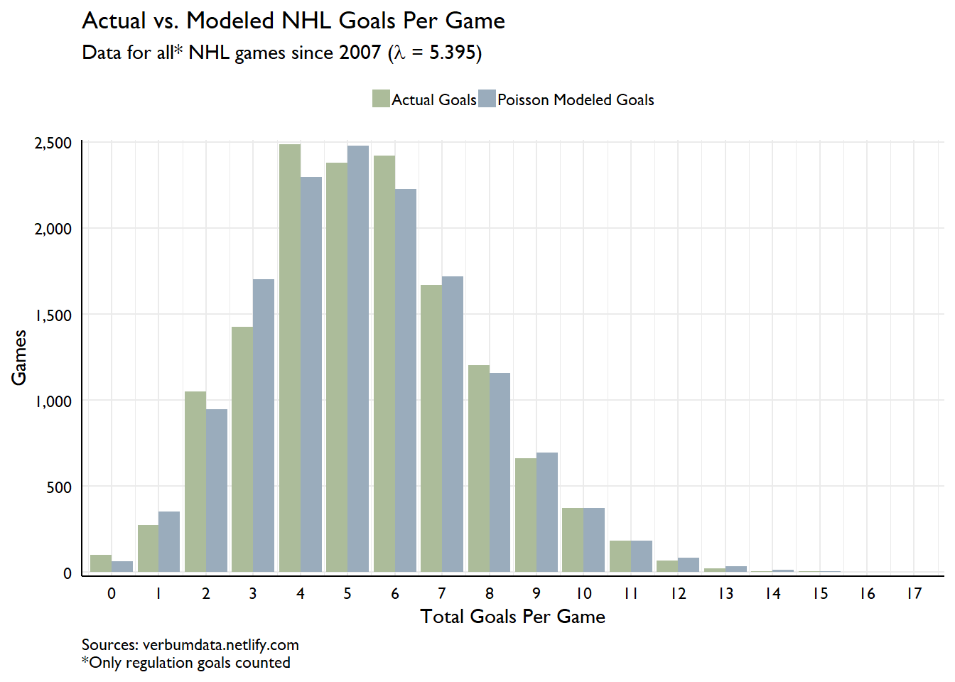
The fit is pretty darn good (and much better now thanks to Jake’s fixes). For those wondering, the game which featured 17 goals occurred on 2011-10-27. The Winnipeg Jets bested the Philadelphia Flyers in Philly 9-8. What a game!